Responsive Design
Our designs adapt seamlessly to all screen sizes and devices, providing an optimal user experience on desktops, tablets, and smartphones.
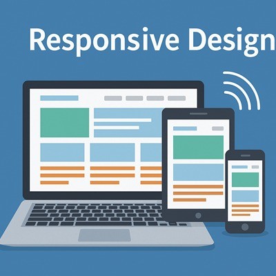
In a multi-device world, responsiveness isn't optional — it’s essential. Our responsive web designs ensure your website looks and functions flawlessly across all screen sizes, from smartphones and tablets to laptops and desktops. This not only improves user experience but also boosts your site’s SEO ranking. We prioritize fast loading times, mobile-first layouts, and interactive elements that keep visitors engaged, no matter how they access your site.
Clients
Projects
Years of experience
Staffs